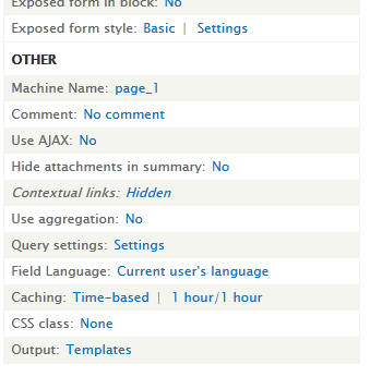
Somehow I made the mistake in #1877376: Change notice: Improve Views UI text for the contextual links display setting of missing the actual UI improvement that was proposed. I propose that instead of using "No", which is hard to attach meaning to - we use "Hidden". This should make it easier to scan. Also makes the form more telling.
Before

After
I propose to put this pattern in place for all yes/no buttons, making them actually say what they are about will be much easier to comprehend and make our forms more usable.
| Attachment | Size | Status | Test result | Operations |
|---|---|---|---|---|
| simplify,hidden.shown_.patch | 1.58 KB | Idle | PASSED: [[SimpleTest]]: [MySQL] 55,560 pass(es). | View details | Re-test |