Problem/Motivation
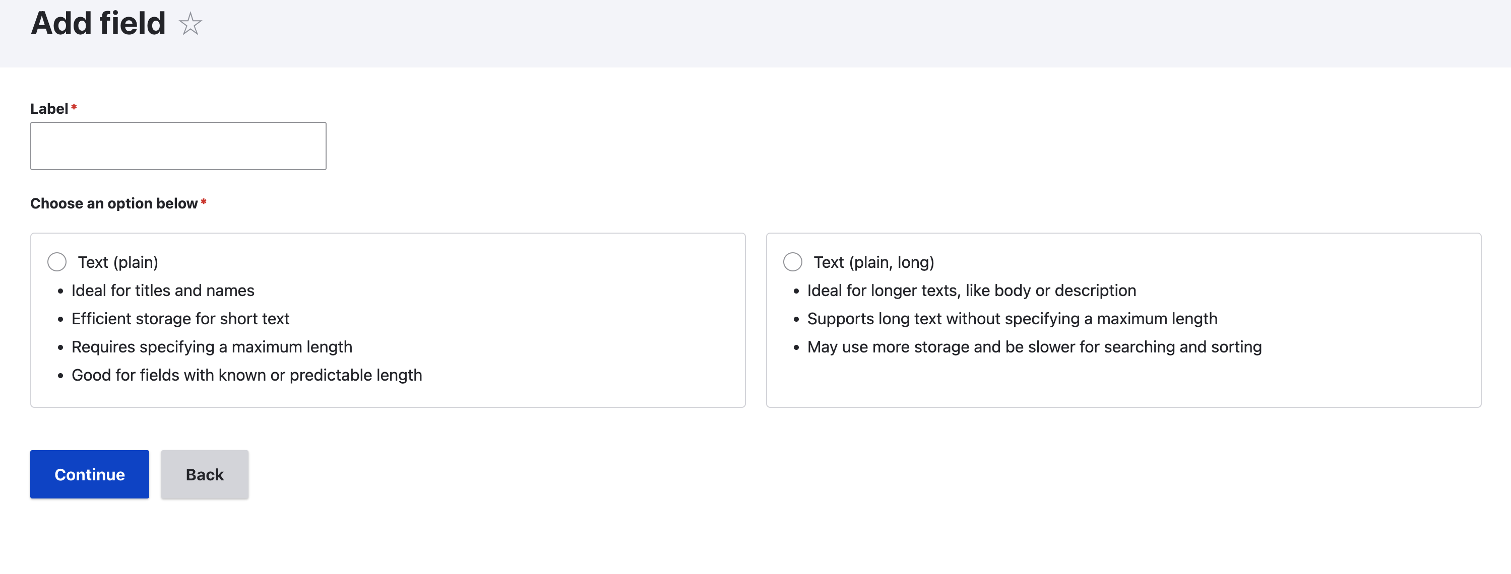
New version of field creation adds unnecessary clutter to the form and increases cognitive load for using the form. ThIs version also breaks conventions on basic html elements. With some changes the form's usability can be easily improved.
Cognitive (gestalt) principles involved are similarity, proximity and same container. The principles are known to take precedence by similarity being overridden by proximity and proximity overridden by same container.
Radio buttons
Radio buttons are based on similarity and proximity. When a radio buttons are placed far away from each other and especially if separated into visual containers the brain will not understand them to be related. Thus here they add visual clutter and cognitive strain by not matching familiar patterns.
First step before
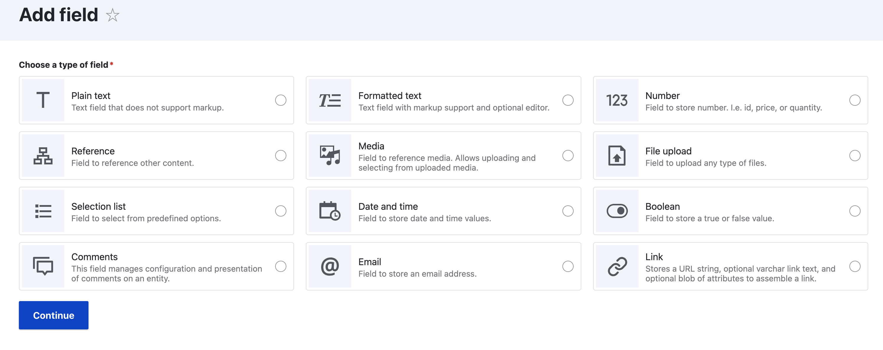
Second step before
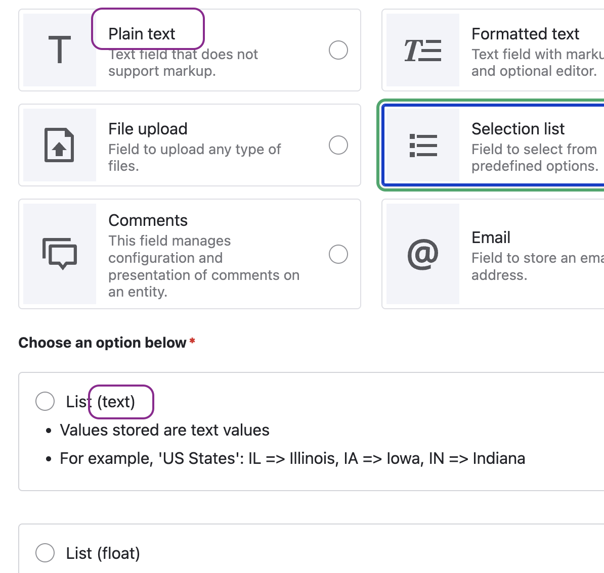
Overlapping options to be addressed in a follow-up #3410851: "Selection list" should be removed from field types and given as an option for "number" and "plain text"
Field types are not well defined and hiding the options details makes user unable to select the correct type without toggling between types to read the options descriptions. Especially selection list overlaps with plain text and number. For end user "selection list" is a display widget for contend that is either text, number or reference.
Steps to reproduce
Proposed resolution
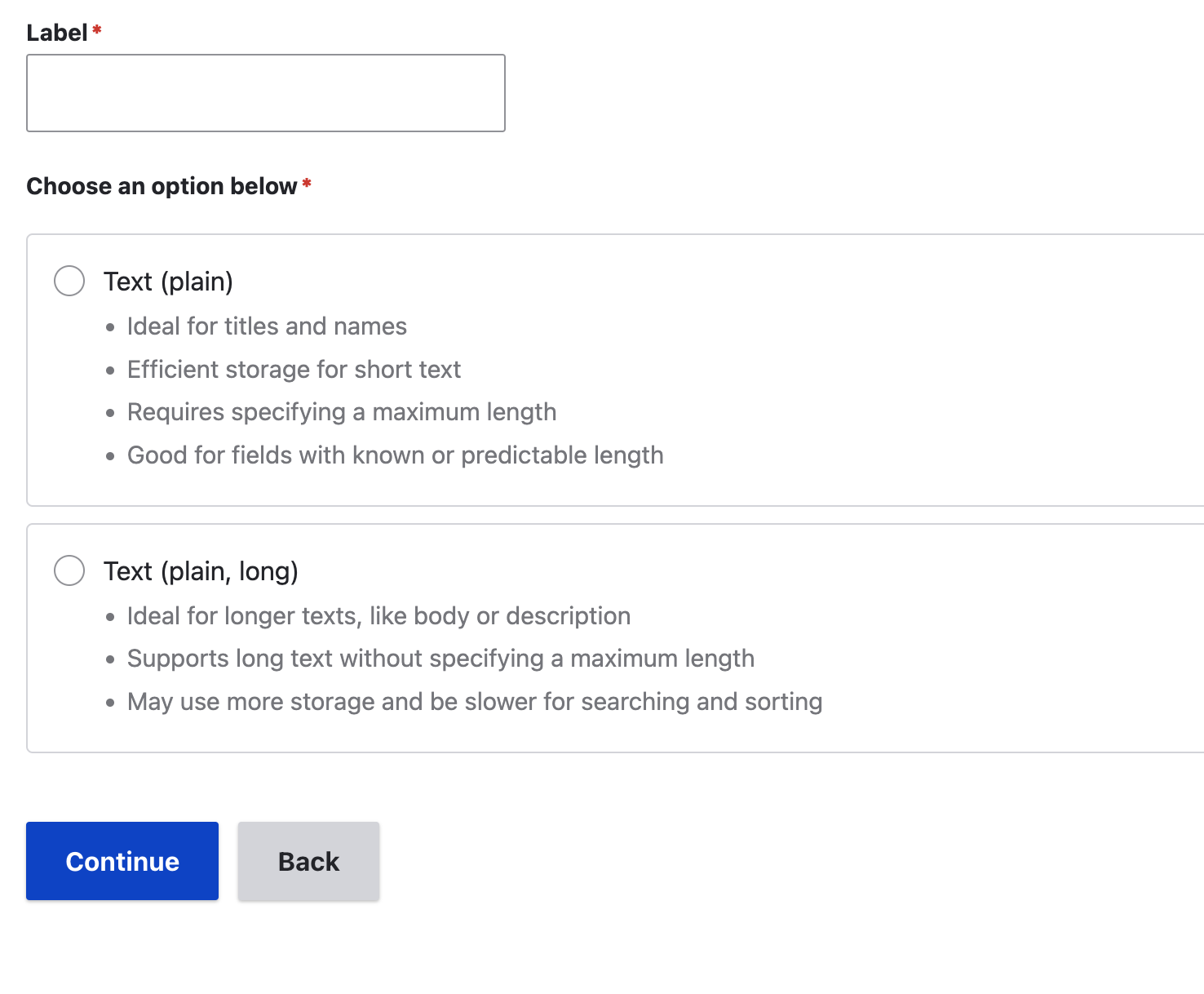
- Radio buttons should never be used unless they are aligned vertically.
- Just visually hide the radio buttons and use the whole box to highlight the hover or selected item.
- Instead of using input for field type, consider using HTML
summaryorhtml_tagfor type anddetailscontaining radiobuttons for options. If we must have input value for type, then consider using hidden and set the correct one based on selected option. This should be logically possible because of the hierarchy/cadinality of types vs options.
- Increase the attention value of selected type and its option to form a group that is recognized as strongly connected items. This could be achieved by proximity (display options next to the selected type) or strong similarity (shape, color), this is eliminated with the use of the two step form as the second step makes a focused sub option approach.
- "Selection list" should be removed from field types and given as an option for "number" and "plain text" (would be addressed later in a follow up #3410851: "Selection list" should be removed from field types and given as an option for "number" and "plain text")
Text content for descriptions should be reviewed in a separate task.
Remaining tasks
Reduce the distance between related options which was partially addressed by #3408326: Make field selection a two-step form , as we moved to a two step form.Convert the first step into using cards as clickable items to navigate to the sub-options.Vertically align all the options on the second step so they are easier to understand.Adjust the tests for the new UI experience.- Accessibility review
User interface changes
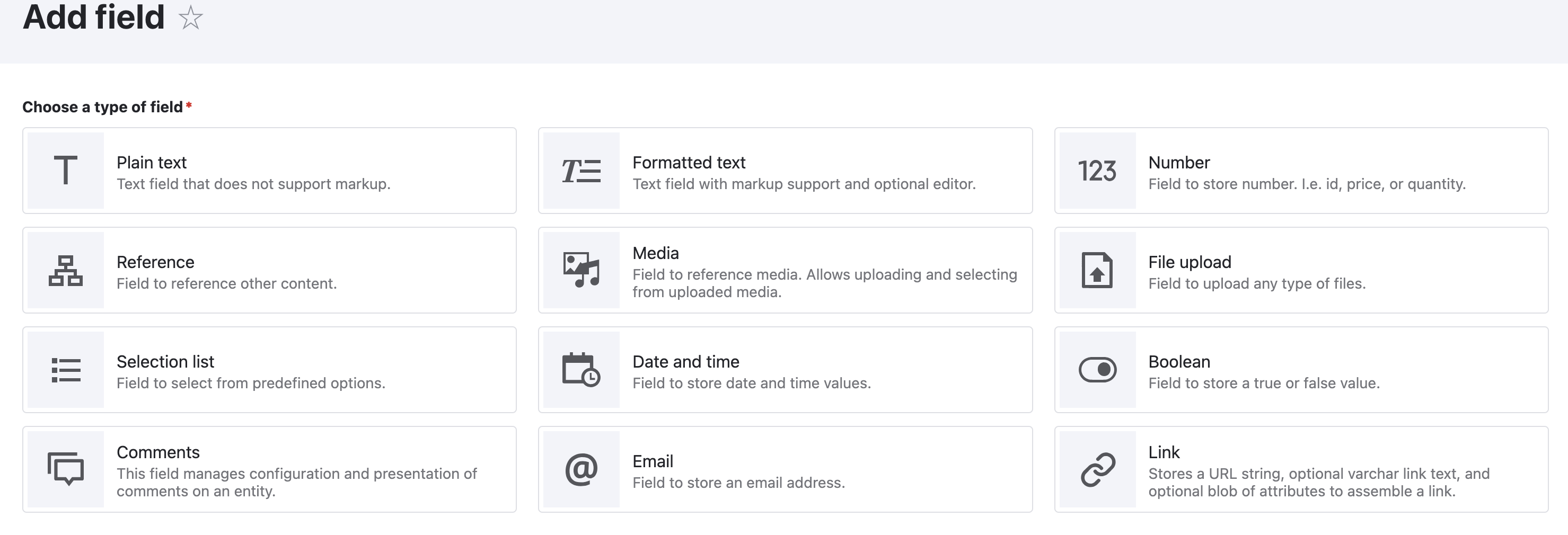
First step after
Now uses clickable cards which navigate to the sub-options/field storage options.
Second step after
Now Vertically aligned for easier scanning.